REBRAND
Category: Branding, Identity, Naming, Tagline
Design Challenge
Rebrand an existing store to improve brand recognition and engagement. Use a comprehensive branding process that includes research, strategy, identity development, and application across key touchpoints. Develop a visually cohesive identity system—not just a logo—grounded in clearly defined client needs, target audience insights, and relevant market trends. Conclude with a brand standards guide banner that demonstrates proper usage and core visual guidelines.
Solution
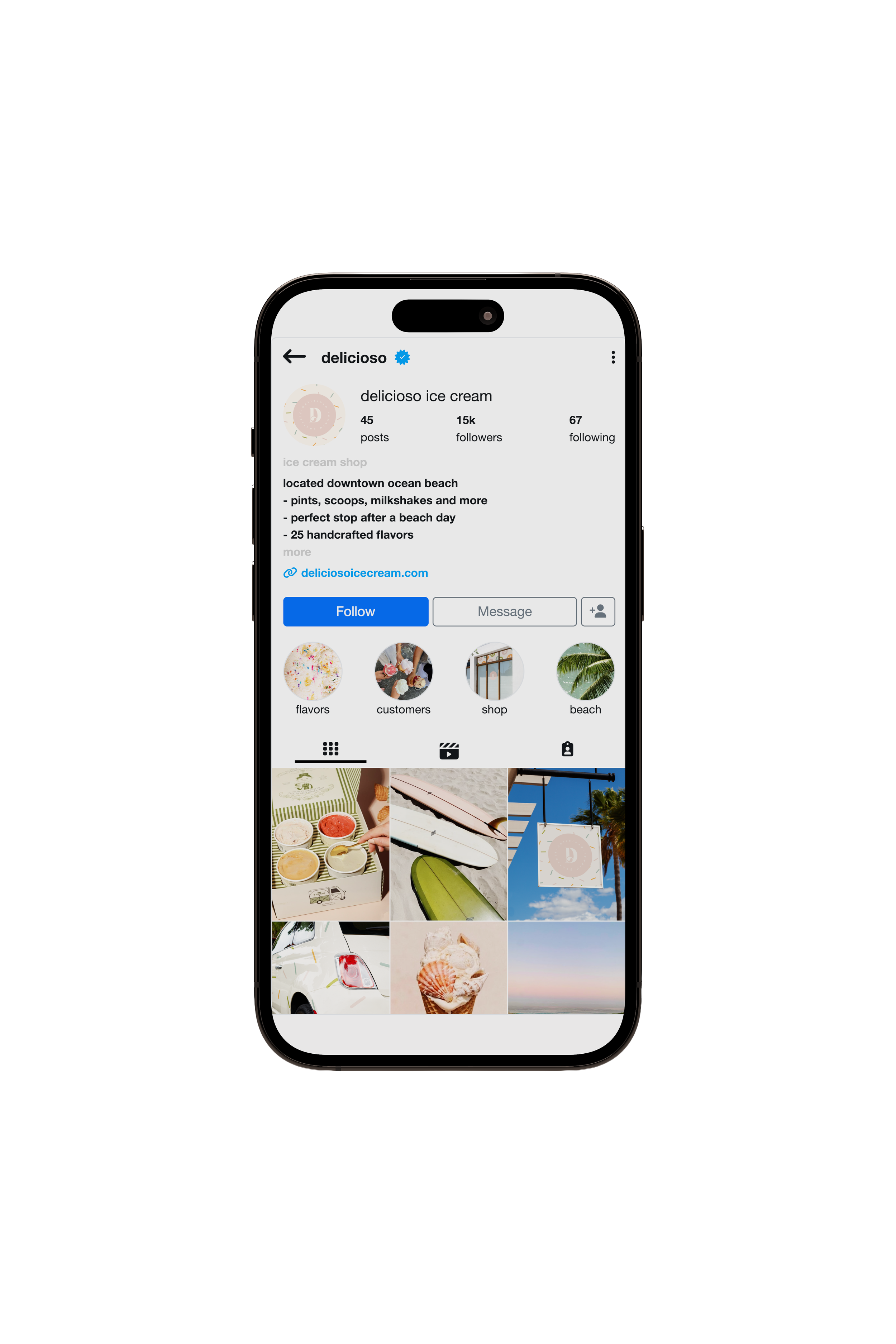
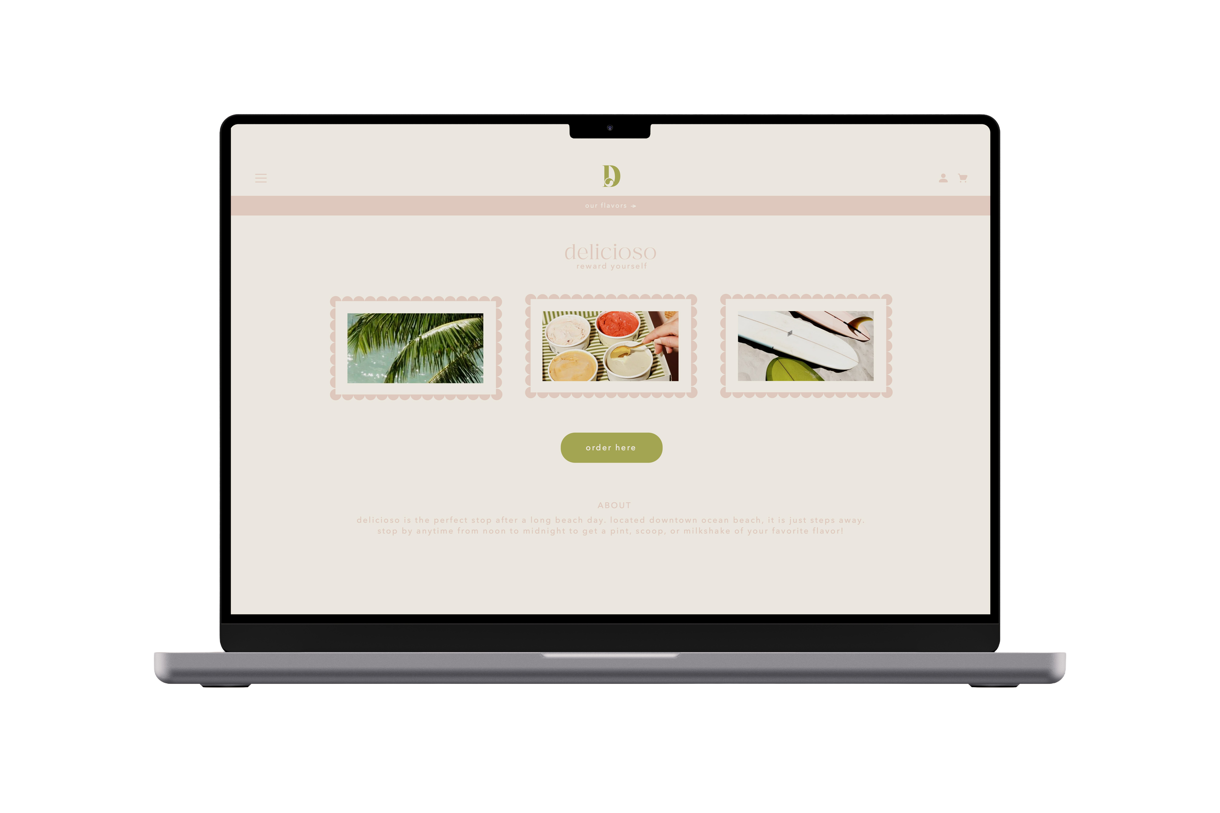
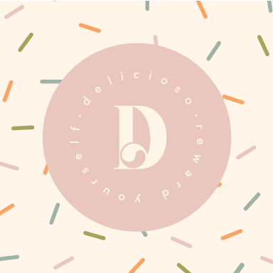
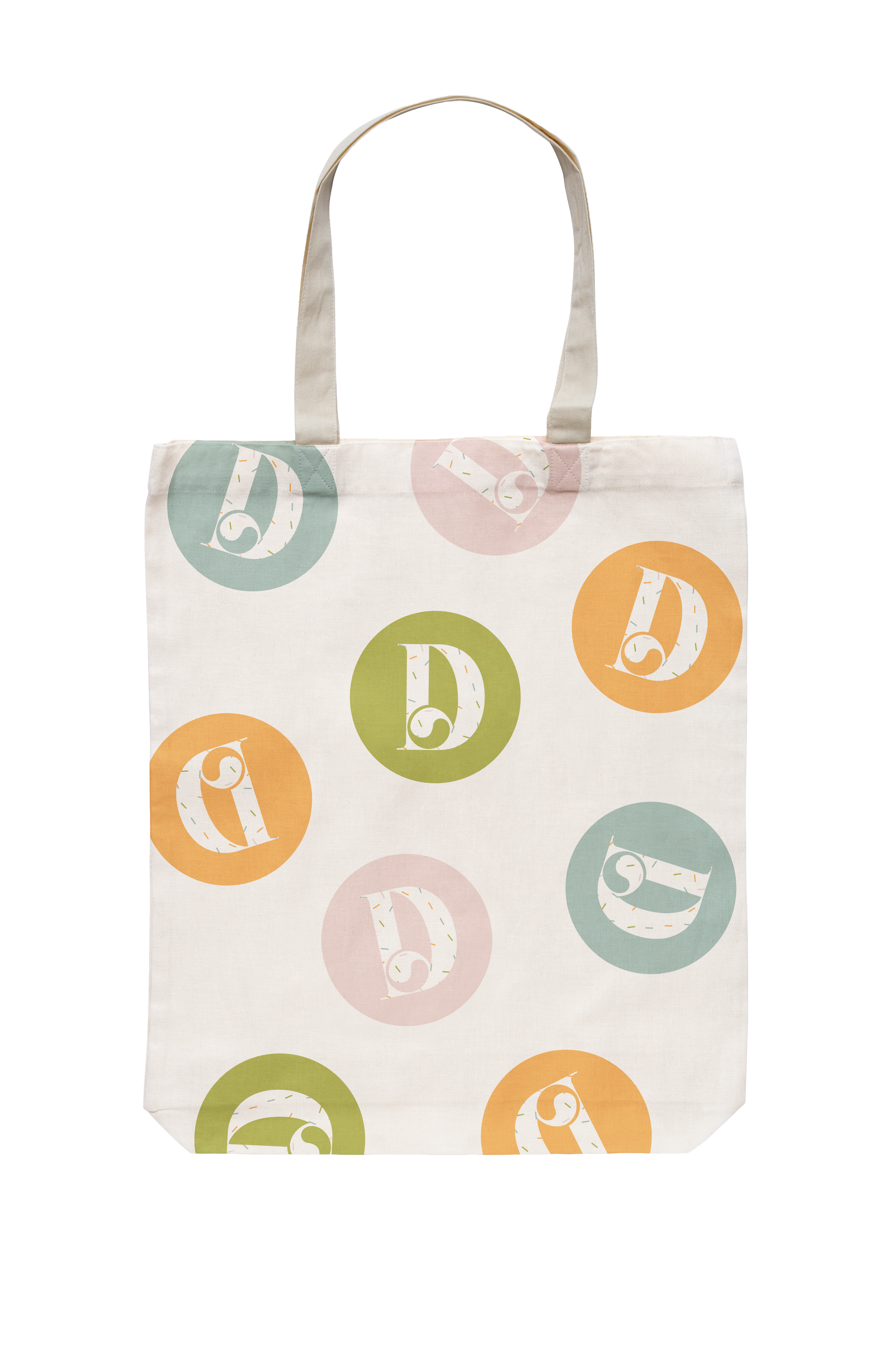
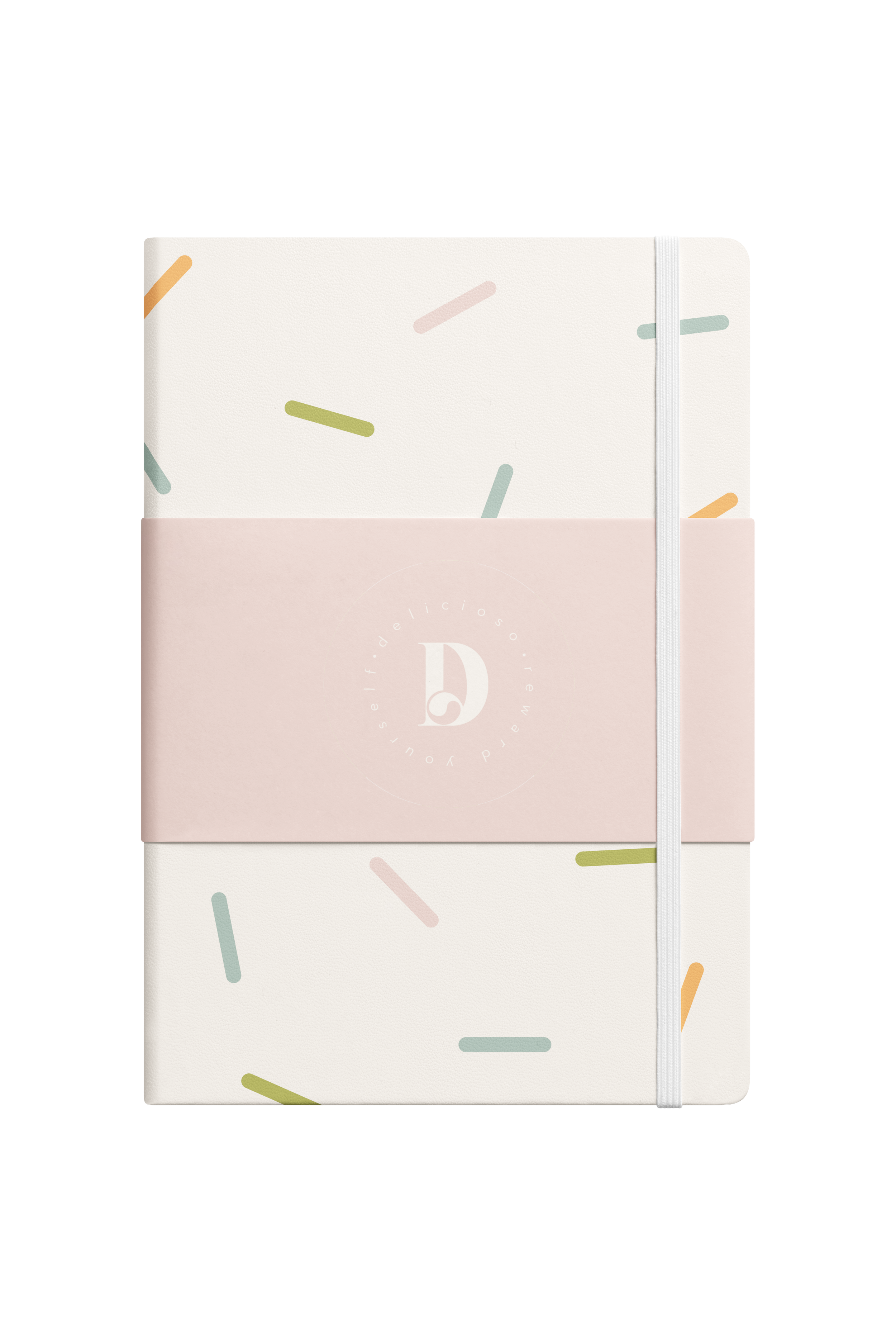
For my rebranding project, I began researching the ice cream shop I was redoing. I went in person to understand the store values, and also read more about them on their website. From this, I decided on wanting the shop to feel family friendly, and like anyone could come grab a treat. Based on that, I came up with the tagline “reward yourself”. The color palette I chose was bright tropical colors that felt very playful. I had the main colors be a warm green, a light pink, and then a creamy white. This rebrand stands out because the ice cream shop uses unique colors, as well as a clean logo, that feels very high end, but also fits with the family friendly vibe of the brand. It makes the company feel very universal, and like people from all over could find a time to reward themselves with a scoop.
Deliverables
Standards Guide Banner, 12” x 60”
Results
Created a cohesive and approachable identity, strengthened the shop’s brand recognition, created a playful yet elevated visual system, tagline resonates with brand, strong visual foundation that can be used across future marketing and in-store materials


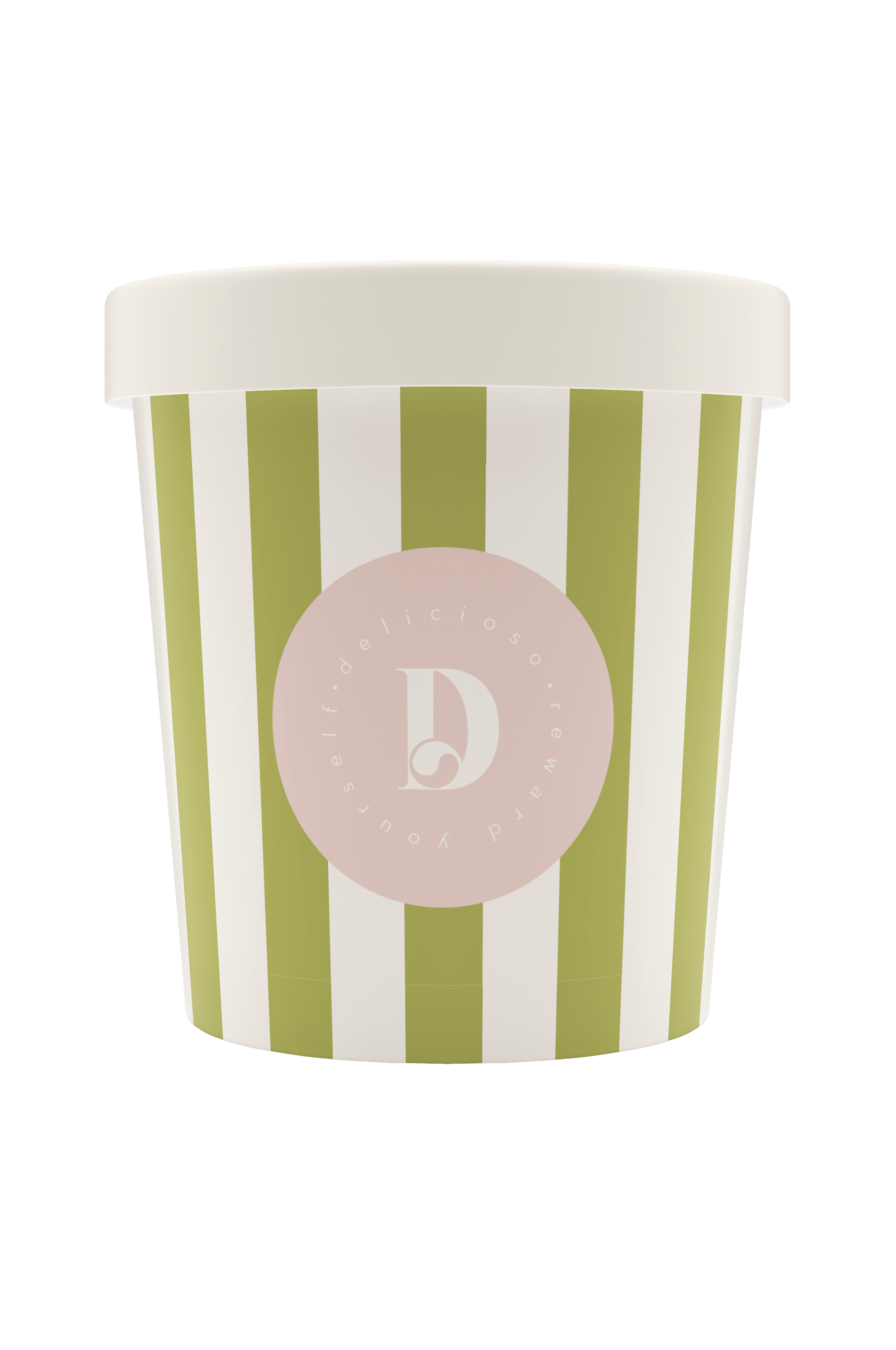
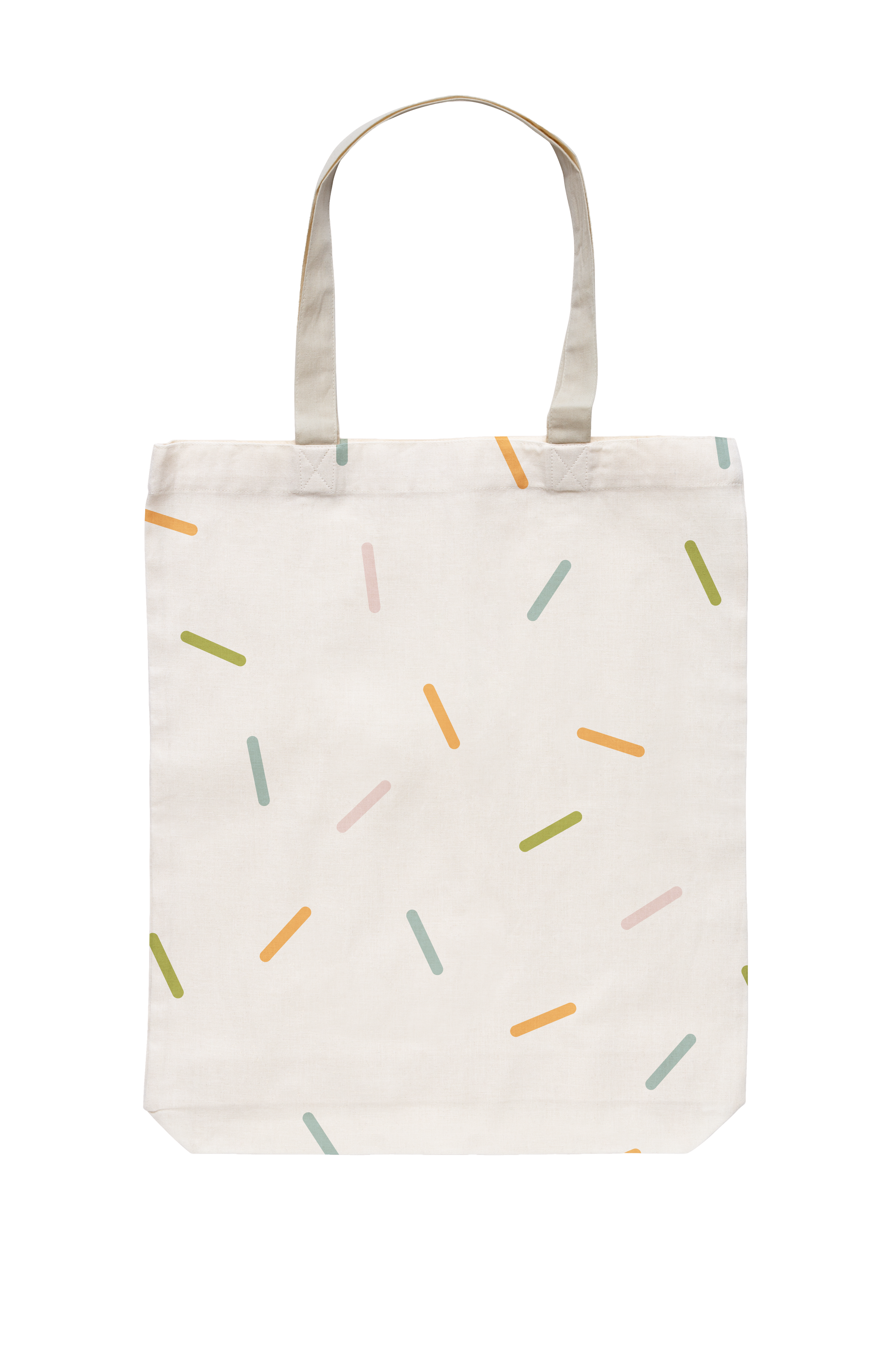
Print Ephemera
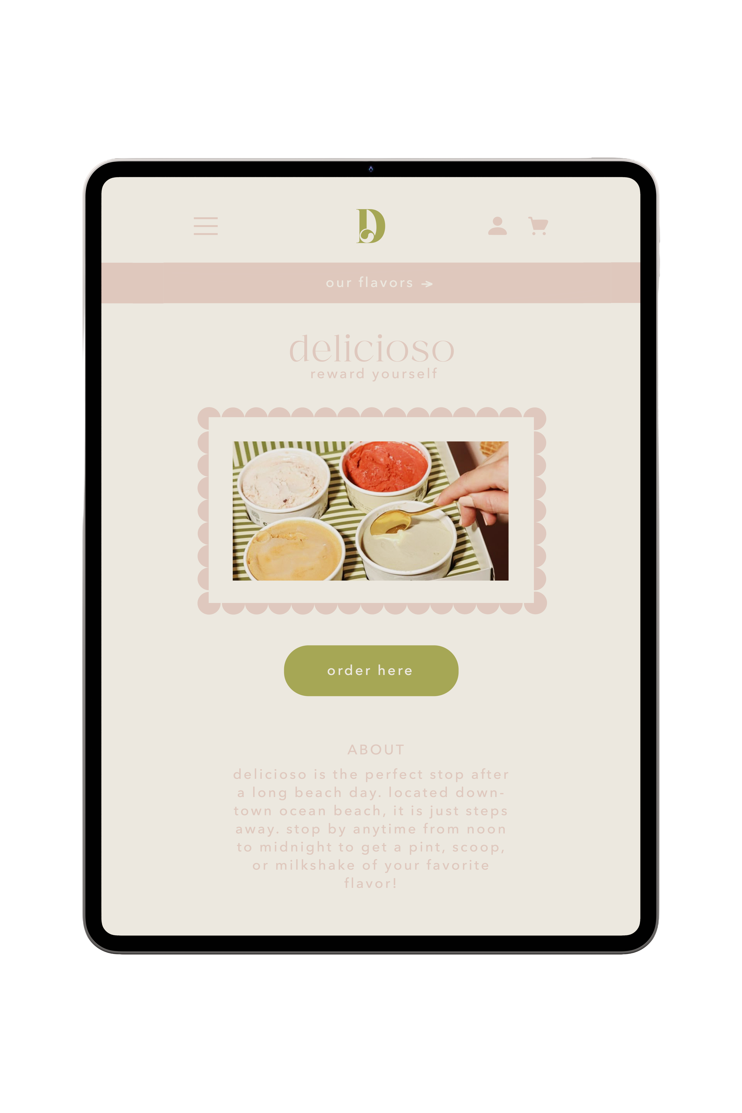
Websites